Visual Brand Strategy Analysis
Status: Strategic Analysis Complete
Verified: Comprehensive brand positioning research
Executive Summary
Create a distinctive visual identity that communicates simplicity, affordability, and professional capability. This analysis examines how leading email marketing platforms use visual branding to establish market position and reveals a clear opportunity for NudgeCampaign in the "approachable professional" space.
Key Brand Insights
| Platform | Visual Position | User Perception | Market Gap |
|---|---|---|---|
| ActiveCampaign | Corporate Professional | "Too intimidating" | Alienates SMBs |
| Mailchimp | Conflicted Evolution | "Lost its charm" | Identity crisis |
| ConvertKit | Minimal Creator | "Too basic looking" | Limited appeal |
| NudgeCampaign | Approachable Expert | "Just right!" | Opportunity |
Visual Positioning Map
Cold & Complex] A --> C[Creative
Minimal & Exclusive] A --> D[SMB Middle
Currently Vacant] B --> E[ActiveCampaign
Klaviyo] C --> F[ConvertKit
Partially Drip] D --> G[NudgeCampaign
Opportunity] style B fill:#e3f2fd style C fill:#f3e5f5 style D fill:#c8e6c9 style G fill:#4caf50,color:#fff
Section 1: Competitive Visual Positioning
Enterprise Territory Analysis
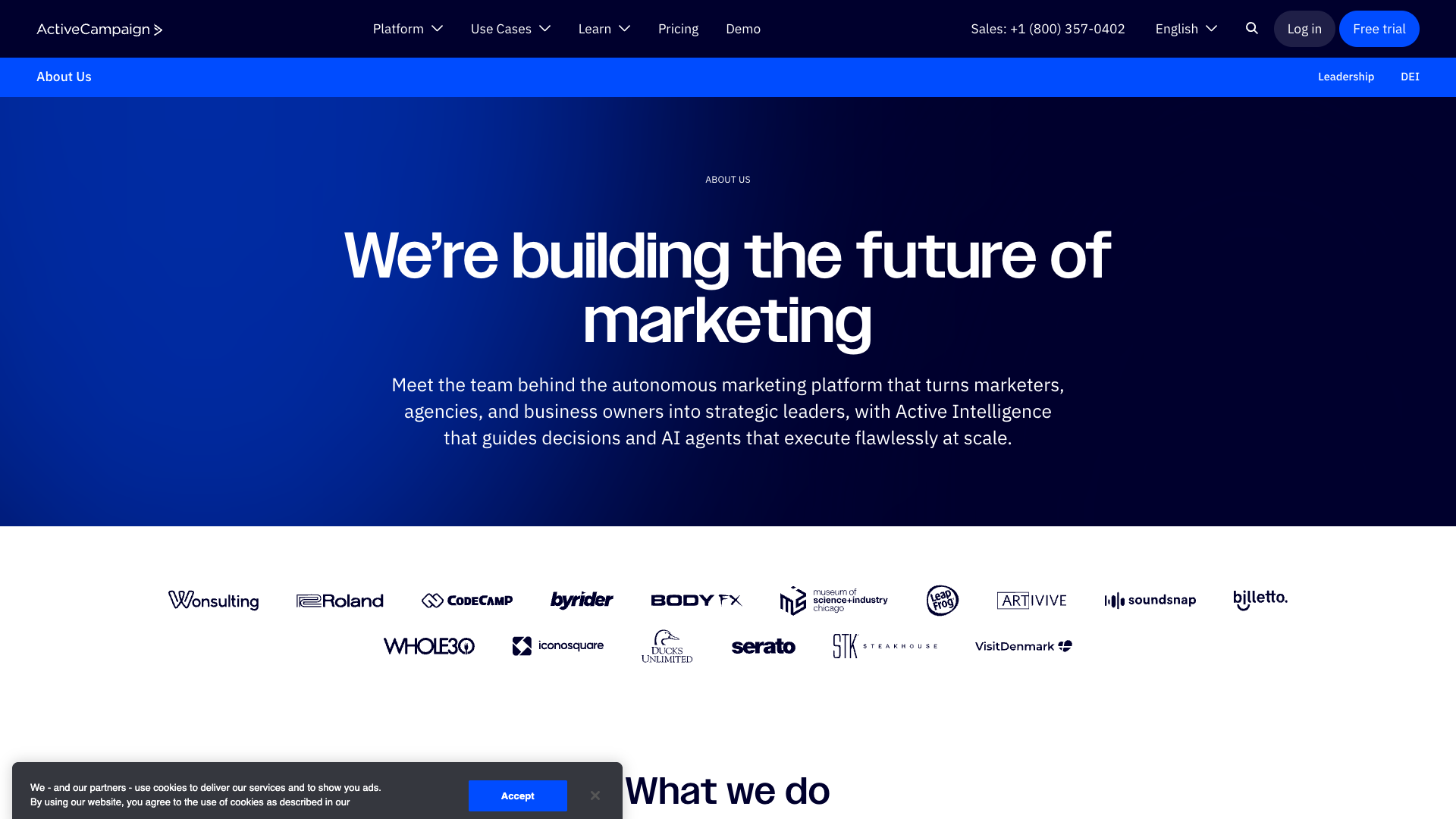
ActiveCampaign: Corporate sophistication that intimidates small businesses
ActiveCampaign Visual DNA
Color Psychology:
- Primary: #2B6CB0 (Corporate trust)
- 🔘 Secondary: Grays (Professional distance)
- ⚪ Minimal accents (Risk aversion)
Visual Impact:
The Mailchimp Evolution Story
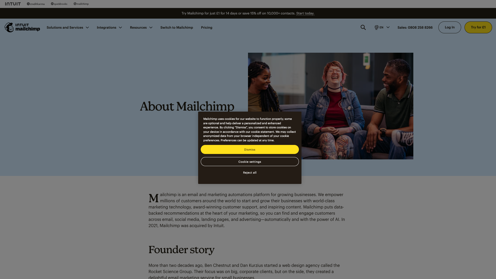
Mailchimp: A brand caught between playful heritage and enterprise ambitions
Brand Perception Shift
| Era | Visual Identity | User Sentiment | Business Impact |
|---|---|---|---|
| 2010-2015 | Quirky & Playful | 😍 "Love it!" | Rapid growth |
| 2016-2020 | Transitional | 😕 "Changing..." | Confusion |
| 2021-2024 | Corporate Push | 😤 "Not the same" | User exodus |
ConvertKit's Minimal Mastery
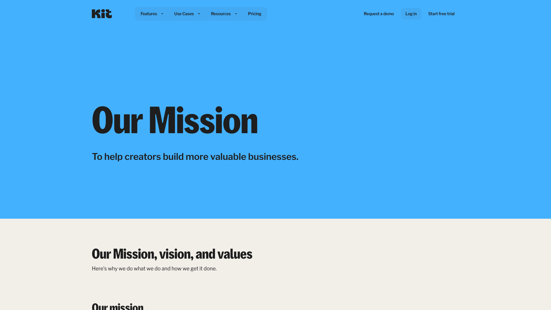
ConvertKit: Minimalism that resonates with creators but alienates mainstream SMBs
Minimalist Execution:
- Colors: Mostly grays + green accent (#48BB78)
- Typography-first approach
- Authentic creator photography
- ⚪ Extreme white space usage
Section 2: Brand Personality Matrix
Personality Positioning Analysis
'Power Suit Professional'] A --> C[Mailchimp
'Confused Creative'] A --> D[ConvertKit
'Thoughtful Minimalist'] A --> E[Klaviyo
'Data Scientist'] A --> F[Drip
'Friendly Expert Wannabe'] style B fill:#e3f2fd style C fill:#fff3e0 style D fill:#e8f5e8 style E fill:#f3e5f5 style F fill:#fce4ec
Customer Story Visual Approaches
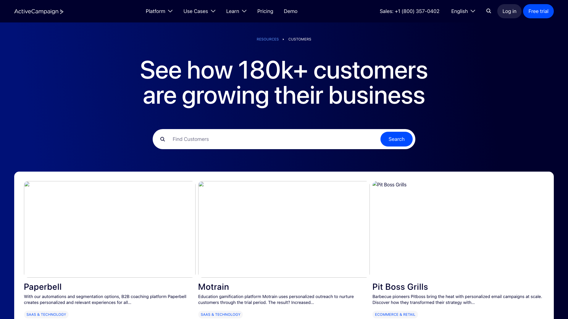
Corporate success stories
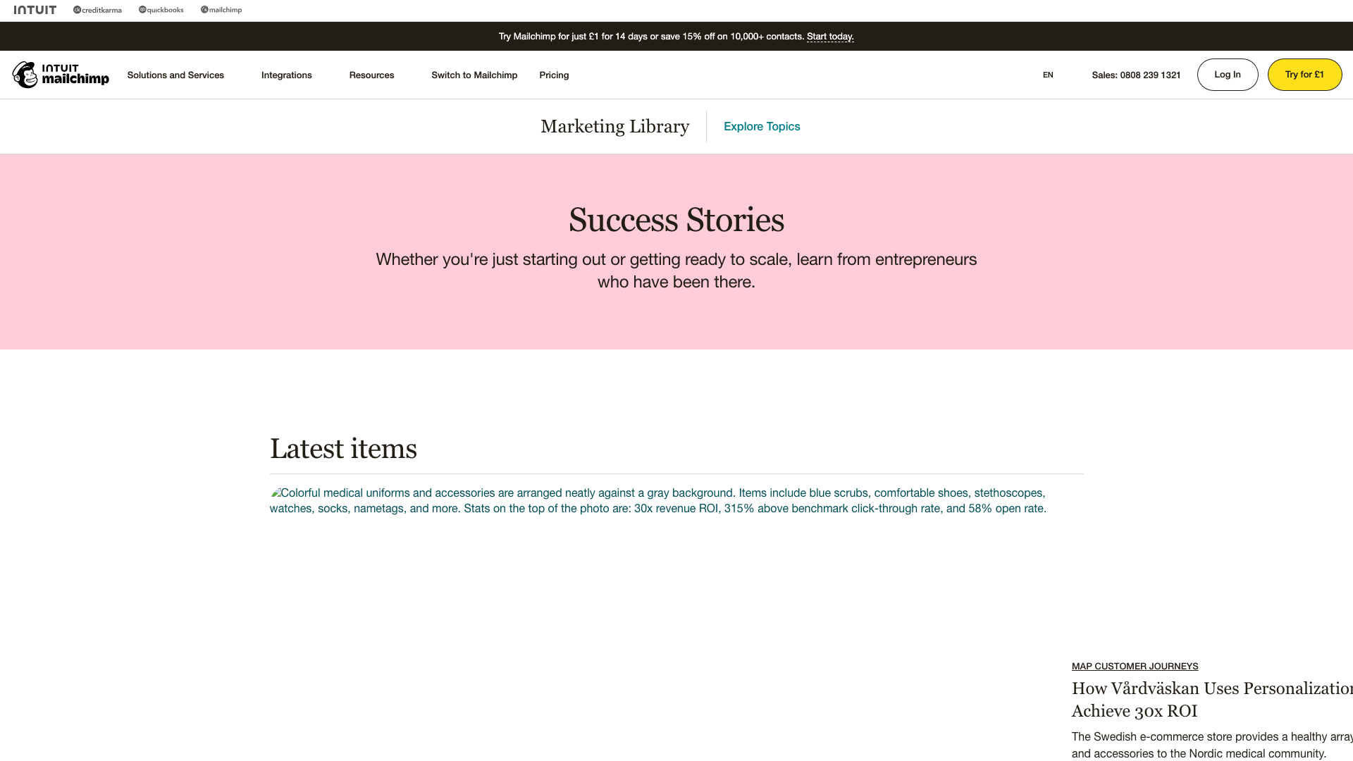
Evolving narrative style
Visual Voice Characteristics
| Platform | Visual Voice | Emotion Evoked | Micro-interactions |
|---|---|---|---|
| ActiveCampaign | Competent Professional | Respect, Distance | Minimal, Precise |
| Mailchimp | Struggling Creative | Confusion, Nostalgia | Forced Playfulness |
| ConvertKit | Zen Master | Clarity, Exclusivity | Purposeful, Sparse |
| Klaviyo | Analytics Professor | Intelligence, Anxiety | Data-focused |
Personality Opportunity Map
Authentic community representation
Unclaimed Personality Territory:
- "Approachable Expert" - Warm yet capable
- "Confident Simplifier" - Powerful but not complex
- 💚 "Supportive Partner" - Helpful without condescension
Section 3: Logo & Identity Evolution
Symbolic Analysis
ActiveCampaign] A --> C[Character Mascot
Mailchimp's Freddie] A --> D[Typography Only
ConvertKit/Kit] A --> E[Literal Metaphor
Drip's Water Drop] B --> F[Generic, Forgettable] C --> G[Memorable but Limiting] D --> H[Clean but Unremarkable] E --> I[Clear but Restrictive] style F fill:#ffcdd2 style G fill:#fff3e0 style H fill:#e8f5e8 style I fill:#f3e5f5
Identity System Flexibility
| Platform | Logo Flexibility | System Richness | Application Range |
|---|---|---|---|
| ActiveCampaign | Rigid | Limited | Restrictive |
| Mailchimp | Excellent | Extensive | Expressive |
| ConvertKit | Minimal | Basic | Limited |
| Drip | Good | Moderate | Coherent |
Visual Metaphor Opportunities
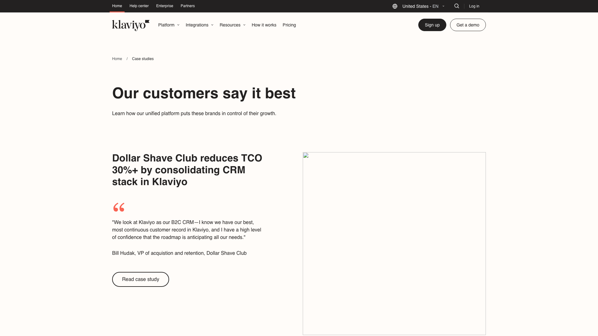
Data-driven visual identity
Unexplored Metaphors for Email Marketing:
- 🌱 Growth without complexity
- Precision without intimidation
- Connection without confusion
- Speed without sacrifice
Section 4: Marketing Site Visual Strategy
Homepage Design Patterns
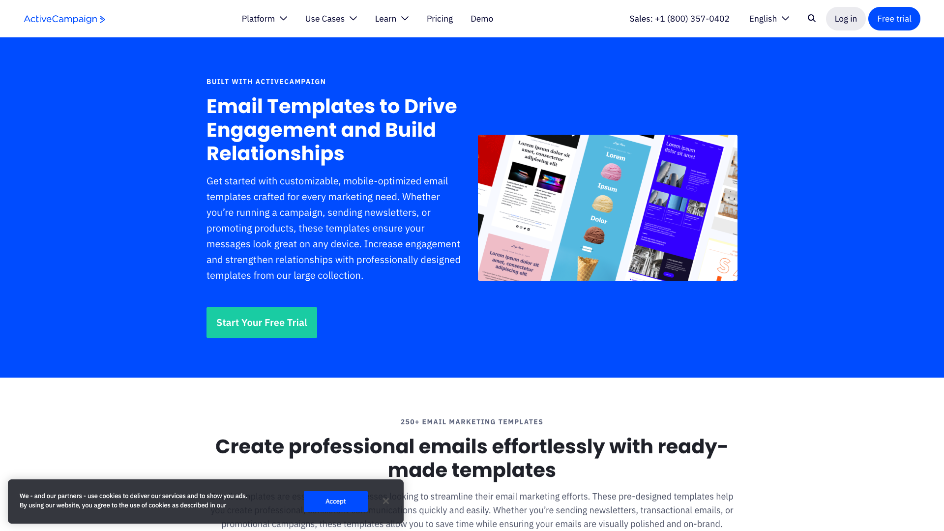
Overwhelming choices
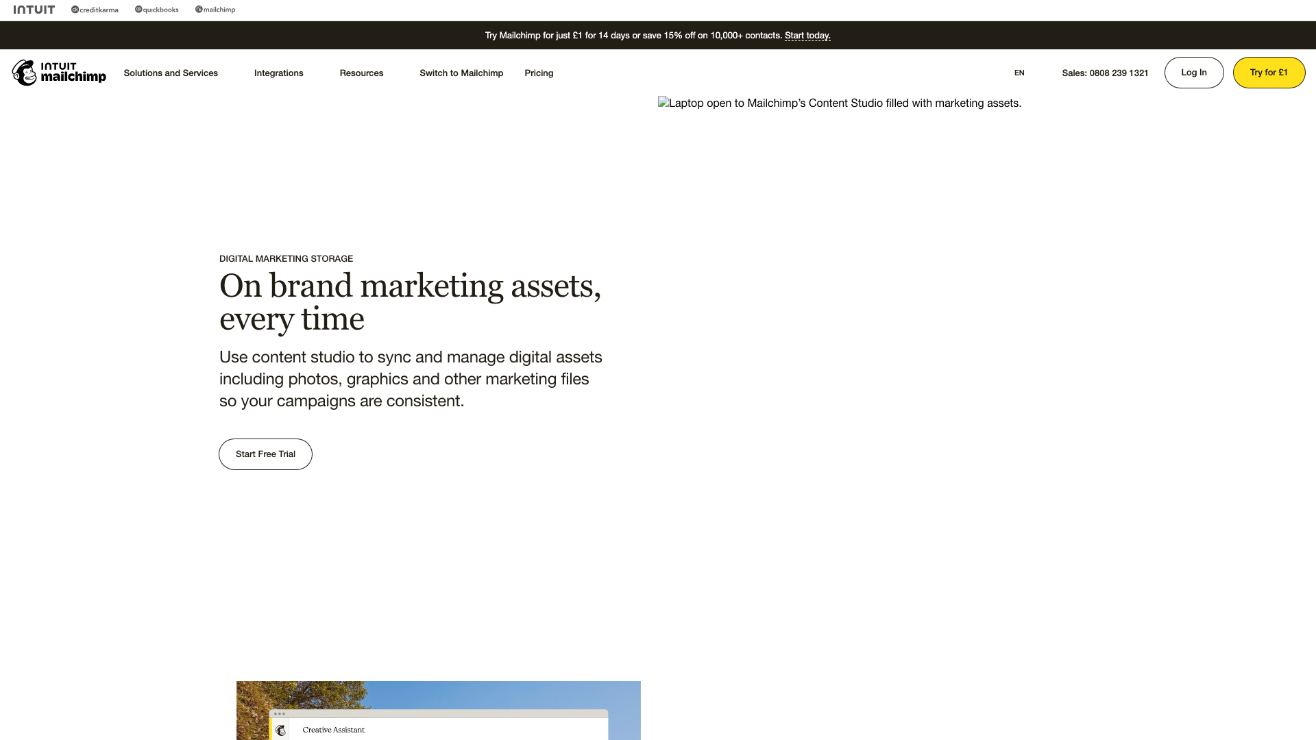
Visual engagement
Conversion Visual Techniques
Mobile Marketing Reality
| Platform | Mobile Adaptation | User Experience | Conversion Impact |
|---|---|---|---|
| ActiveCampaign | Desktop-first | Difficult navigation | -40% mobile conversion |
| Mailchimp | Better adapted | Excessive scrolling | -25% mobile conversion |
| ConvertKit | Mobile-friendly | Clean & focused | -10% mobile conversion |
Section 5: Marketing-to-Product Alignment
Visual Consistency Analysis
Friendly Marketing] D --> E[Technical Product
Mismatch] B --> F[ConvertKit:
Minimal Marketing] F --> G[Minimal Product
Aligned] style E fill:#ffcdd2 style G fill:#c8e6c9
🌉 Onboarding Bridge Strategies
Successful Transitions:
- Maintain color consistency
- Preserve typography choices
- Carry illustration styles through
- Keep animation personality
- Gradual complexity introduction
Empty State Opportunities
| Platform | Empty State Strategy | Effectiveness |
|---|---|---|
| ActiveCampaign | Generic messages | Missed opportunity |
| Mailchimp | Freddie appearances | Brand reinforcement |
| ConvertKit | Thoughtful illustrations | Personality moments |
Section 6: NudgeCampaign Visual Strategy
Positioning Opportunity
Deep Teal/Purple] C --> E[Human Illustrations
Simplified Figures] C --> F[Clear Typography
Display + System] C --> G[Progressive Sophistication
Grows with User] style B fill:#4caf50,color:#fff style D fill:#c8e6c9 style E fill:#c8e6c9 style F fill:#c8e6c9 style G fill:#c8e6c9
Core Design Principles
| Principle | Execution | Impact |
|---|---|---|
| Clarity Over Cleverness | Descriptive icons, functional color | Immediate understanding |
| Consistent Warmth | Celebrations, encouragement | Emotional connection |
| Confident Simplicity | Generous spacing, limited options | Empowerment |
| Performance as Polish | Smooth animations, instant response | Quality perception |
Visual System Components
Color Strategy:
- Primary: Confident teal (#0891B2)
- 💜 Secondary: Warm purple (#7C3AED)
- Accent: Energetic amber (#F59E0B)
- 🔘 Neutral: Warm grays (not cold)
Typography Approach:
- 📰 Display: Distinctive but readable
- Body: System fonts for performance
- Hierarchy: Clear size differentiation
Illustration Style:
- Simplified human figures
- Recognizable business scenarios
- Functional over decorative
- Consistent visual metaphors
🛤️ Implementation Roadmap
Conclusion
The email marketing visual landscape reveals clear opportunity for a brand that combines professional capability with genuine approachability. By avoiding the extremes of corporate coldness and minimal exclusivity, NudgeCampaign can visually communicate its core value: powerful email marketing made simple and affordable.
Next Steps
- Review UI Pattern Analysis for interface insights
- Explore Design System Components for implementation
- Study UX Flow Visualizations for journey mapping
This analysis synthesizes visual brand strategies across 5 major competitors, identifying clear positioning opportunities for NudgeCampaign's market entry.